01.

The Challenge

Finding the perfect song for your video is harder than it might seem. You want to get more than just the right genre or tempo, you want to match the vibe perfectly. We decided to let artists search in the way that they feel most comfortable with. So we provided multiple ways to search.

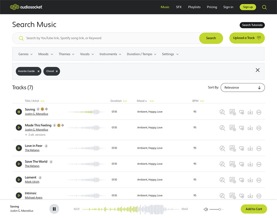
First, the user is simply presented with an extremely powerful search box that allows you to put whatever you want: A keyword, a song link, or genre.

Next, we provide a Search Guide on how to search so users can get familiar with all of the ways they can find music on the site. This includes a short overview video on each way to search.

02.

Complex Search. Clean Interface

We really wanted to find the balance between presenting a clean interface that also had the most powerful search tools. We started by focusing on design elements that stayed out of the way: Great type hierarchy, clean, thin lines, and use of icons for track explanations.

We kept the same free-form search box from the homepage but then added detailed filters and keywords into dropdown menus that makes them accessible without cluttering the interface.

03.

Make it Personal

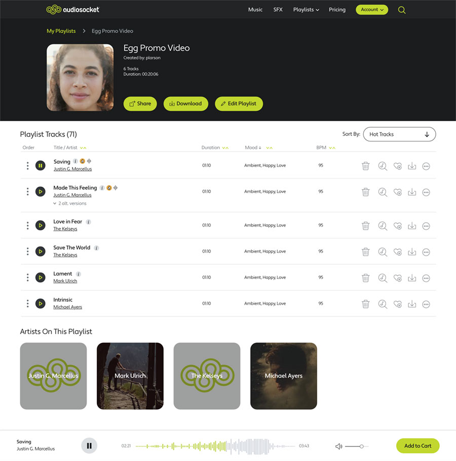
Many other music licensing sites have a simple playlist feature but it feels thrown-together and minimal. One of our priorities was to make the site feel like a personalized library for each user so it can be an effective creative tool for them.

We wanted users to be able to customize their playlists with names, thumbnails and give them all the playlist and track info they would need to evaluate each track for their project. The result was a robust screen and functionality that makes their playlist feel personal and connected to their project.
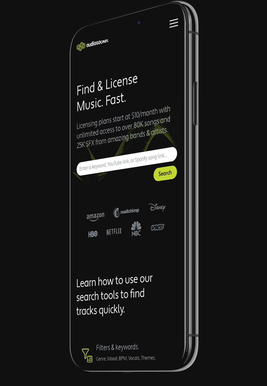
Screenshot of Audiosocket Individual Playlist Page
04.

Mobile in Mind

We wanted full functionality on a mobile device. This made it a tall task to fit all of the complicated screens on the phone. To accomplish this, we started design on a mobile format before thinking about the desktop format. This meant that we weren’t tempted to limit functionality or elegance for creators who film and edit on their phones.

We also took into account the differences between a touch interface and a mouse-driven interface. We made sure that icon and button sizes accomodated finger sizes. This effort also included making sure that typography would scale elegantly across all platforms.

Lantz-Boggio Architecture provides top-notch architecture for senior living centers, government buildings, health care, and commercial buildings. They wanted a fresh, modern website that showcases their expertises and does a deep-dive into case studies. We spent time architecting a site that uses a brand video we produced and custom team photography and allows them to easily add detailed case studies of their work.

Brand Video

The Website Process

01.

Architecting the site

We spent time creating wireframes for each important page template that allowed us to think through how best to structure the site and identify copywriting before diving into site design.

02.

A modern content-rich design

We presented several design options and made sure to show off the beauty of their architecture and interior design. We didn’t want to overwhelm site visitors with a text-heavy site but rather show off their work with video, photography, and impactful headlines. The design was simple so that users of any industry or age group could easily navigate the site.

We took care to design the site to display just as beautifully on mobile, tablet, or desktop.

Photo of the Lantz-Boggio website homepage
03.

Showcasing the Portfolio

We created a beautiful case study page for each project they wanted to feature, showcasing photos of the outside and interior. The project details break out key pieces of information and use pull-quotes to make it easy for people to get a clear idea of what makes the project special.

04.

The Team at Their Best

We photographed the entire team in a unified style that matched the refined look of the website. We placed quotes throughout the site so potential customers can get a feel for the personality and expertise they would be working with.

Screen shot of the About section of the Lantz-Boggio website

Egg Strategy provides highly strategic and innovative services to Fortune 500 companies. The website needed to clearly convey their services clearly as well as showcase their innovation through the website design and flow.

01.

The Process

Egg came to us with a strong sense of who they are and how they wanted to communicate their services. We used our experience architecting website messaging, hierarchy, and structure to collaboratively create wireframes to make sure the site effectively communicated their services and approach. The wireframes allowed them to get internal feedback from senior leadership about site structure and messaging. It also facilitated copywriting and design of the site.

02.

The Result

Ready Fire created a website that uses highly interactive design, parallax movement, smart copy, and high-quality photography to convey Egg Strategy’s highly innovative work. We also created smart layouts to showcase case studies and articles in a sophisticated way to allow potential clients to get an insight into what Egg can do for them.